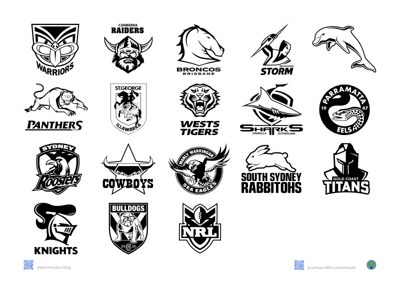
In the world of sports branding, logos play a crucial role in defining a team’s identity and connecting with fans. Recently, I shared the logos of AFL teams, but I must admit that the NRL logos stand out for their modern and consistent style.
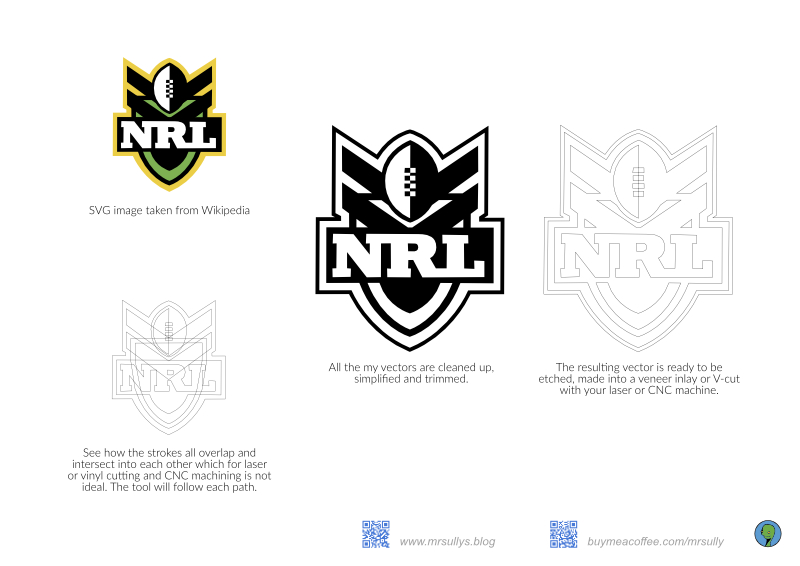
NRL logos have undergone significant transformations over the years, embracing a modern aesthetic with the of bold clean lines, strategic spacing, and clear typefaces, making these logos much easier to work with, especially for designers who have had to deal with outdated, complex designs.
AFL clubs, on the other hand, have also been updating their logos to strike a balance between tradition and modernity. I do apprecate the AFL’s effort to engage with a broader audience while respecting the rich history of each club.
The shift towards minimalism and one/two/three-color designs is a prevailing trend in sports branding. This approach simplifies logos, making them more versatile and easily recognizable across different platforms, especially in the digital landscape. The use of large typography is another trend that adds dynamism to sports branding, capturing attention and conveying energy.
Come back for the Premier League next.